>Next Generation Symbian UI
Posted on January 18, 2010
>
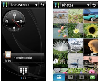
Screen shots of what Nokia wants to see in the next generation Symbian^4 UI.
As posted on The Register
The titlebar has new, more compact signal strength and battery indicators that appear no matter what app you’re in. The title is application-dependent – on the homescreen, it would name the operator, for example – and would double-up as a tappable space to call up a dropdown Options menu, signalled by the down-facing triangle.
Read the full article here.
Edit
Here is a little more about this story


Be the first to leave a comment