>Slicky not sticky

>Convectional wisdom suggests websites should be sticky. The longer someone spends on a site the more successful it is and the better we have engaged them.

It struck me that this might be rubbish, that maybe we should begin to consider how spending less time on a site is an equally valuable measure of a sites success.

Most people when visiting a site are there to complete a particular task, be it find a piece of information or buy something. The quicker they can do this, the sooner they can get back to their life. The last thing they want is a sticky website that slows them down and distracts them from the task in hand.

So that’s slicky not sticky, easing the process not slowing it down.

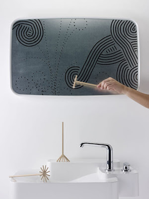
>Zen Tools by Giulio Parini

>

After taking a shower and when the bathroom becomes filled with steam, use the zen tools to decorate and play with the foggy mirror. Cool idea from here

>Nice low tech interface

>

I don’t even know if this app exists, but it looks great. 
Imagine google maps with this kind of look & feel.

>Don’t depend on rollovers

>Look at a site on an iPad, iPhone or in fact any touch device and you will notice the rollovers no longer  work. Yes this is pretty obvious, touch has no hover state, but it means that if you are relying on this to let users know that they can interact with something it’s not going to work on a touch device and you users will become confused and frustrated.

A good example of this is Light box. On a touch device those little arrows that indicate you can click on the left and right of the image no longer appear. So users who have never seen this before don’t know they can interact with the image to see more. Another example is mystery meat navigation, suddenly this becomes impossible to understand and requires wild guessing to navigate.

As more interaction takes place via touch devices we can no longer depend on rollover states to inform users of how they can interact. Sure we can still use them, but just don’t depend on them.

>Wimbledon Mobile App

>Nice integration of augmented reality, although the app looks a little complicated – feature bloat?

>Interaction design meets architecture

>I’ve recently been thinking about whether interaction/user experience design can be elevated to the same level as architecture.

In many ways I think there are significant similarities between the two. Considering the increasing amount of time people are spending digitally interacting with systems and each other, this field is certainly growing in importance within society.

With this in mind, I spotted this article about Interaction Design and Architecture on Johnny Holland. The videos explore the point at which architecture and interaction design meet. This one is fantastic


Dan Hill-Keynote: New Soft City from Interaction Design Association on Vimeo.

>Shantell Martin talks about the power of collaboration

>

Talking about collaboration she says
“… and they get to put a little spin on your work and you get to take that and spin it back. And the more you do that the more you create something that is propelling it self much higher than you could ever do by yourself.”